
The Giving Map COVID-19 map visualizes publicly collected data published by the Coronavirus Resource Center at John Hopkins University. We present data to help people make informed decisions of how and where to donate, as well as how to keep themselves and their friends and loved ones in different parts of the country safe.
Giving Map chose to use data counting confirmed COVID-19 cases to keep the data consistent and objective. In the first months of COVID-19 case and death data reporting, states, cities, and municipalities had varied recording procedures and testing was not as readily available. Cities and counties continuously adjusted their procedures for totaling deaths and as a result, death counts fluctuated. An article from the Washington Post dated April 16, 2020 outlined the different methodologies implemented by Alabama and Colorado where Alabama take additional time investigating and counted only those deaths that were directly caused by COVID-19. In contrast, Colorado counts “epidemiologically linked” cases. The CDC however, counted only deaths in which the presence of coronavirus was confirmed in a laboratory test. The CDC recognizes that this method resulted in an underestimation of cases. In mid-April, the CDC also changed how it would count people, stating that cases where the infection was not confirmed by a test would be counted.[1]
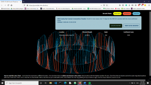
Early on, we decided to visualize the data so that it could be actionable and informative. Using epidemiology growth trends chart we graphed the 3D Lotus Chart data visualization to show COVID-19 trends for a smaller subset of counties before we designed the Giving Map.
Giving Map initially used historical cases as a ranking system but in order to best direct donations and support, we moved to a 14-day average of new cases. Here is the reasoning behind our decision.
While states and the federal government were figuring out how their tallying procedure for cases and deaths, Giving Map began visualizing the historical positive cases. This data was useful as we were able to gauge how the virus was developing in major population centers. Yet, as major infection centers shifted we recognized this had day-to-day limitations and had to rethink how we visualized the data to direct support to areas that needed help.
Once a county reached ten thousand cases, it would be classified as the highest possible infectious rate category as per our ranking. At that point, the data visualization became static and the limitation to that ranking was that we could not see the impact of local measures to contain the virus on day-to-day reporting. We knew local measures such as social distancing, limiting or prohibiting gatherings, limiting travel, and restrictions on business activities helped get initial hotspots under control but once they reached the ten thousand cases, we saw the need to change from total cases to 14-day averages.[2] Total historical cases are important data to measure, but it does not present an accurate picture of which areas are being devastated in real time.
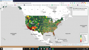
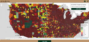
In addition to new cases, Giving Map shows population-adjusted rankings. Currently, we show new cases per 25,000 residents for the past 14 days. The 25,000 resident figure is not arbitrary, but approximates the median U.S. county population of 25,726.
We recognized that large population centers will naturally outnumber smaller communities and show the highest reported positive cases but those figures do not always adequately capture where resources should be directed. To make the map dynamic, we have an eight-color scale. The colors change six times for the first 100 positive cases. This makes the map dynamic and captures the slightest changes to give a clear image of the impact a particular community is facing with COVID-19. These changes further our goal of directing people who want to help people in the most impacted areas.
In November 2020, we added a “code purple” to represent the increasing severity of the epidemic. However, the other values on the color scale have not changed and retain historical continuity.
 Giving Map relies on the data collected and presented by the John Hopkins University Centers for Civic Impact. The sources for this data include the Coronavirus COVID-19 Global Cases by the Center for Systems Science and Engineering at JHU, the Red Cross, the Census American Community Survey, and the Bureau of Labor and Statistics. Furthermore, data on COVID-19 cases is collected from state and city health agencies. Washington State, for example, has tasked its Department of Health to collect and publish this data. [3]
One of the challenges to present accurate data from COVID-19 tests is that it relies on people voluntarily getting tested if they are asymptomatic or presented mild symptoms.
This is an ongoing project and we continue to improve on the visualizations to help people make informed decisions. As we approach the general election season, we recognize that cases and data will continue to be politicized. However, we are committed to working with publicly available data to remain objective.
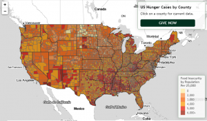
Our second interactive giving map, the Hunger Map, was launched on December 17, 2020. Hunger Map data is based on an October 2020 study by Feeding America: ‘The Impact of the Coronavirus on Food Insecurity in 2020’, contributed by Dr. Craig Gundersen, Adam Dewey, and Emily Engelhard.
[1]“ Which deaths count toward the COVID-19 death toll? It depends on the state.” By Emma Brown, Beth Reinhard and Reis Thebault. April 16, 2020. https://www.washingtonpost.com/investigations/which-deaths-count-toward-the-covid-19-death-toll-it-depends-on-the-state/2020/04/16/bca84ae0-7991-11ea-a130-df573469f094_story.html#comments-wrapper
Accessed September 13, 2020
[2] “Washington’s Phased Approach” as presented on the state’s official Coronavirus 19 website. https://coronavirus.wa.gov/sites/default/files/2020-05/PhasedReopeningChart.pdf
Accessed September 13, 2020
[3] “2019 Novel Coronavirus Outbreak” Washington State Department of Health https://www.doh.wa.gov/Emergencies/COVID19
Accessed 9/12/2020