Categories
Uncategorized

Some Notable Achievements from Giving Map

March 16, 2023

I have literally never been part of a more successful open source volunteer project. We had more volunteers than paid staff, and their contributions were lasting and impressive. Based on the reach of our viral social media campaigns on Twitter and Facebook (estimated 3-6 million views) I know our work saved lives.

Unfortunately, the project came to a halt due to my health issues from severe fibroids. The physical symptoms, in particular anemia from hemorrhage and blood loss, were unmistakable and debilitating and only grew worse over time. It took multiple surgeries and months of recovery time to stabilize.

Leading a non-profit initiative under COVID lockdown was challenging to say the least. But an outstanding team of volunteers and paid staff made the difference.

I would like to thank the leadership team at PDX Hackerspace, Jon Hannis in particular.

We did good work. Thank you for your role in facilitating this.


Tess Gadwa

Program Director
Giving Map

Categories
Uncategorized

Today is Earth Day

It’s hard for me to say, “Let’s celebrate!” because the planetary situation is so desperate. Climate change continues unabated. If you have to drive on any weekday afternoon at rush hour, you will see that the COVID-19 crisis has done little to remediate our country’s crushingly heavy carbon footprint.

If you are wondering what to do, I have a few suggestions:

I want to recommend one book in particular, which is endorsed by one of the early volunteers and founders behind Giving Map.

Six Degrees: Our Future on a Hotter Planet: Lynas, Mark: 9781426203855: Amazon.com: Books

We have some time. Future generations will not have that luxury. Let’s take what we have and make it count.


Tess Gadwa

Program Director
Giving Map

Categories
Uncategorized

Announcing the Hunger Map

Click the interactive map to donate in the areas in the United States most impacted by hunger in 2020.

Hunger Map

Candice Parker
Candice Parker, Giving Map Open Source Developer and Hunger Map Creator

I became involved with this project because I wanted to help people who have been seriously impacted by COVID-19, particularly children. I chose hunger as an issue because of massive food insecurity and children affected not being fed three square meals a day. Some counties have food programs in place to feed school age children 18 years old and younger, breakfast and lunch.

In many counties this is not the case and when it is, the support is not sufficient. My goal for the Hunger Map project is to give local food banks the support they need to feed families impacted, enough food to survive a whole week.

Giving Map is proud to partner with Feeding America who has been generous in sourcing us data from their latest research, ‘The Impact of the Coronavirus on Food Insecurity in 2020’, contributed by Dr. Craig Gundersen, Adam Dewey, and Emily Engelhard. According to Feeding America more than 50 million people may be affected by food insecurity in 2020, which includes a potential 17 million children, as compared to over 35 million people affected in 2019.

My hope is that people will interact with the Hunger Map, read the statistics, and contribute to help end hunger.

Candice Parker,
Hunger Map Creator and Lead Developer

Giving Map is a nonpartisan, not-for-profit initiative created in partnership with Lotus.fm LLC, Ctrl-H PDXCharity Navigator, and the Shelby Cullom Davis Charitable Fund, and a core team of dedicated open source volunteers.

To learn how you can get involved, visit our Github repository or contact us online.

Categories
Uncategorized

Giving Map Animated Time Lapse PSA Goes Viral

Between November 25 (the Wednesday before Thanksgiving) and December 15, 2020, Lotus.fm’s series of time lapse infographics on the spread of COVID-19 went viral on social media, reaching an estimated 6.2 million online viewers with more than 10,000 shares across Facebook and Twitter. These animated 4D data visualizations show cases and deaths from Coronavirus during Fall 2020.

Knowing that holiday travel and gatherings could be a dangerous vector for the virus to spread, we worked hard to reach influencers and get the word out among our base. We believe that data science can change the world and save lives.

Lotus.fm produced these visualizations as Public Service Announcements to accompany the Giving Map: our ongoing initiative for grassroots philanthropy in the areas of the US hardest hit by the pandemic. The PSA animations are available for download and reuse in GIF and MP4 formats, under a Creative Commons license. Please contact us if you require a different resolution or format, or would like to request a time lapse for a specific time period or geographic area.

Categories
Uncategorized

Introducing Code Purple

Updated December 4, 2020

“#MaskUp folks. We haven’t even seen the worst yet.” – Dr. Eric Feigl-Ding, sharing our map on Twitter.

This summer Givingmap.org created an interactive, dynamic map to show the areas of the country that were hardest hit. We used a simple color code—green for counties with few or no cases per 25,000 residents, and yellow, orange and red for counties harder hit.

COVID-19 Spread Time Lapse Animation
Spread of COVID-19 in the Continental US: Fall 2020

Two weeks ago, we woke up to the reality that our map was more than half red. The color coding system of the Giving Map is not just informational. It is designed to give concerned individuals a way to connect with communities in need. With this in mind, we have introduced a new color category: “code purple,” designating the parts of the country with the highest rates of COVID-19 infection. As of today more than 40 counties across the United States qualify as “Code Purple.”

Watch this time lapse animation to see how the infection has worsened across the continental United States this fall:


Watch Fall 2020 Time Lapse Animation on YouTube


Watch Eight-Month Time Lapse Animation (April – December 2020) on YouTube

We are faced with the reality that for every one case of COVID-19 reported, between five and ten people may be spreading the virus without showing symptoms or knowing that they have it. It’s no secret that Coronavirus infection rates are spiraling out of control in the United States, with over 1 million new infections in the past week and over 9,000 deaths. But certain places in the United States have been hit much harder than others. Most of these are in the Midwest, West, and South: the “Heartland of America.” Many are rural areas. View List of Top 200 Counties with the Highest COVID-19 Infection Rates.

Not everyone understands the risks of travel in this holiday season. Please stay safe and do what you can to educate others.

Tess Gadwa

Program Director
Givingmap.org

Data Source: Johns Hopkins University

Categories
Uncategorized

Celebrate Giving Tuesday

December 1, 2020

Giving Tuesday is a well-established tradition in the holiday season, but this year feels a little different. Why?

Because the pandemic has changed the operating reality of charities across the world. In a survey this summer, nearly one third of nonprofits were concerned they might be forced to close their doors within a year.

That was nearly six months ago. Whether we are talking hunger, availability of beds in hospitals, unemployment, or homelessness, conditions have worsened in many parts of the country.

Giving Tuesday is a unique institution because it doesn’t tell you where to donate or what to do. You can volunteer or advocate for a cause you believe in. If you are looking for worthwhile organizations in the parts of the country most directly impacted by COVID-19, our interactive map can help you find them. Giving Map November 20

Please give or volunteer if you are able. But above all, stay safe. Avoid travel and gatherings when possible and stay informed about the risks from COVID-19. This is another way in which we help each other, today and every day in this truly unique moment in history.

Categories
Uncategorized

Giving Map Calls a Code Purple

Giving Map Calls a Code Purple; Adds Call to Halt Thanksgiving Travel

Dynamic COVID-19 map and time-lapse animation provides startling demonstration that could spur cancellations of holiday gatherings

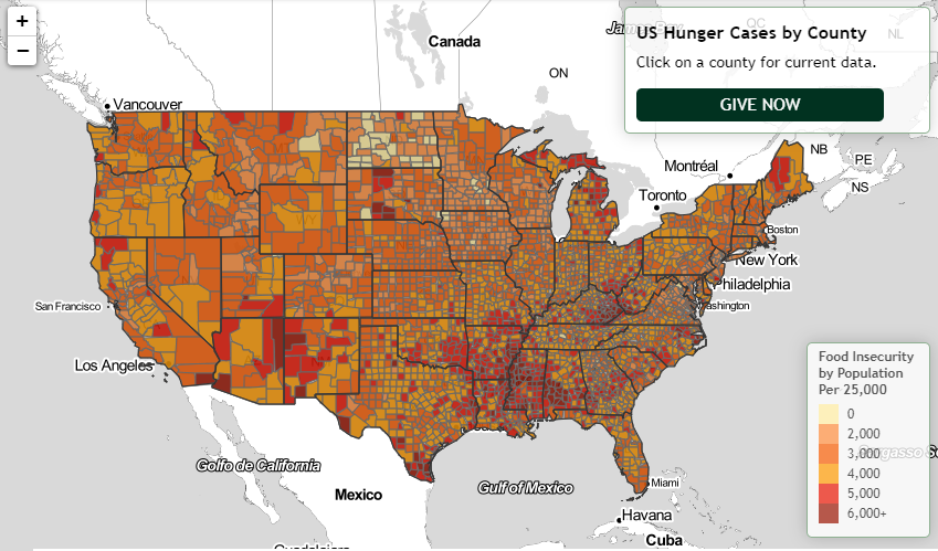
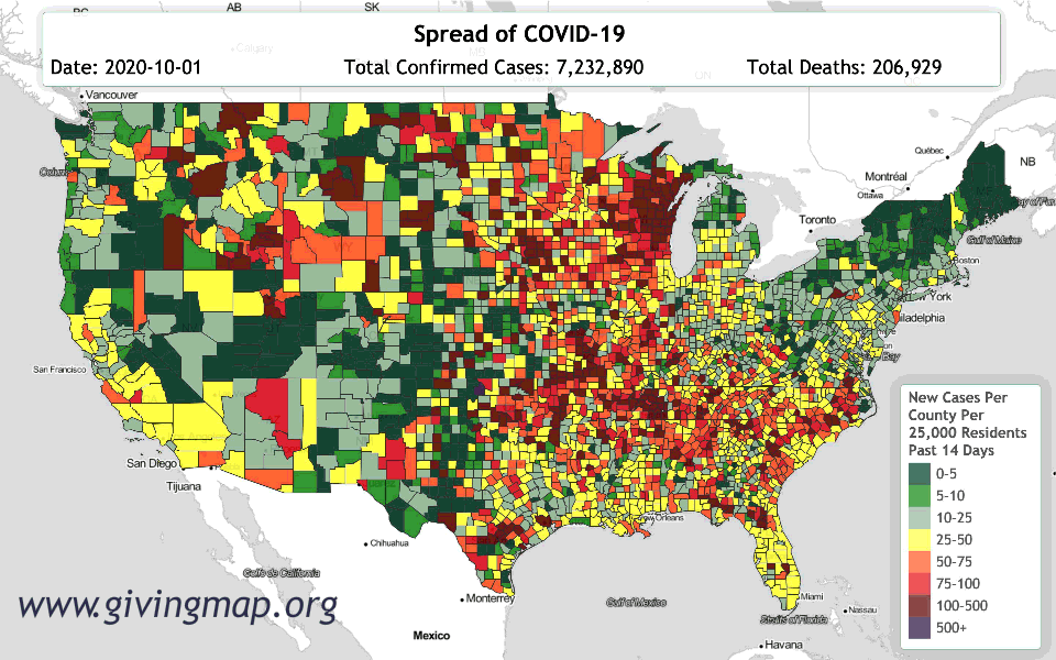
Portland, OR (November 20, 2020) – This summer, Givingmap.org’s interactive COVID-19 map showed the US counties hardest hit by COVID. The organization used a simple color-coded scheme — green for counties with few or no cases per 25,000 residents, and yellow, orange, and red for counties harder hit. The darkest red color indicated counties with more than 100 cases per 25,000. The goal was to connect potential donors with the hardest hit counties.

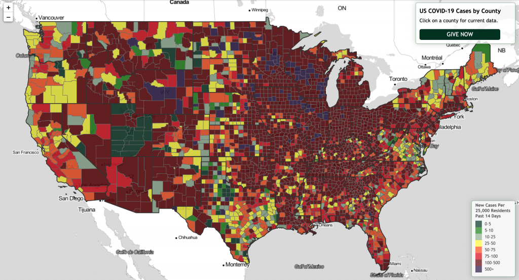
About a week ago, the Giving Map team woke to a map that was more than half red.

Today, Givingmap.org is introducing a new color category on the dynamic map: purple. Counties colored purple on the map have the highest rates of COVID-19 infection, more than 500 cases per 25,000 in population. As of today, November 20, 2020, there are 94 purple counties. (List of top 200 counties.)

For every case of COVID-19 reported, between five and ten people may be spreading the virus without showing symptoms or knowing that they have it. In Wisconsin, more than one-third of COVID-19 test results in the past week have come back positive. The CDC is recommending that people cancel holiday travel plans and reconsider any gathering that includes people from outside their immediate household.

“With all this in mind, we would like to add our voice to the calls to reconsider holiday travel,” said Tess Gadwa, program director of GivingMap.org. “If our map gets one unknowingly infected person to stay home for Thanksgiving, we could save lives.”

This time lapse animation provides a stark demonstration of the current situation and the speed of infection. Start the animation to see how quickly the infection has spread across the country in only the past few weeks. Share it with family and friends who may be considering attending or hosting a gathering.

“It’s no secret that Coronavirus infection rates are spiraling out of control in the United States, with more than 1 million new infections in the past week and over 8,000 deaths,” continued Gadwa, “Many of these are in the Midwest, West, and South. Many are rural areas. No one is safe.”

About GivingMap.org

GivingMap.org is a nonpartisan, not-for-profit initiative created in partnership with Lotus.fm LLC, PDX HackerspaceCharity Navigator, the Shelby Cullom Davis Charitable Fund, and a core team of dedicated open source volunteers. Follow Giving Map on Twitter  – @GivingMap

Categories
Uncategorized

Giving Map Awarded $80K Grant for Data-Driven Philanthropy

November 10, 2020

Today, Giving Map received an $80,000 grant from the Shelby Cullom Davis Charitable Fund to continue its work on Giving Map, a data-driven grassroots philanthropy web portal currently focused on COVID-19 relief.

Giving Map

“We are excited to begin work on Giving Map 2.0,” says Tess Gadwa, Program Director of Giving Map. “We had tremendous success with the initial release this summer. People really gravitated to the core concept of the map, whether to learn more about areas of the country affected by COVID-19 or to make charitable donations.”

All funds raised go directly to the nonprofits listed through the site. Giving Map is a pass-through organization and does not take any commissions or fees. The next release of Giving Map will include a more refined user interface to select nonprofits, as well as more opportunities for featured organizations to tell their own stories. It is expected to launch in early 2021.

“Looking at the types of online experiences that are available for e-commerce and for-profit crowdfunding, we feel the same tools can give people truly meaningful ways to connect with and learn from organizations doing important work,” says Gadwa. “Nonprofits have lost many of their key revenue sources, even as demand for their services has skyrocketed. Many are in danger of closure. We believe Internet-based grassroots funding is one way to help close the gap.”

The Giving Map web app draws on case data compiled daily by Johns Hopkins University to show the areas hardest hit by Coronavirus. Donors can contribute in any of ten categories, including Mental Health, Food Insecurity, Shelter Insecurity, and Parks and Environment. It is available for all web browsers on tablet, personal computer, and phone. The code base is open source and freely available on GitHub.

Giving Map is a nonpartisan, not-for-profit initiative created in partnership with Portland, OR data visualization startup Lotus.fm LLC, Ctrl-H PDXCharity Navigator, and the Shelby Cullom Davis Charitable Fund, and a core team of dedicated open source volunteers.

Our mission is to connect caring people with grassroots organizations working for equity, healing, and sustainability across the globe.

Media inquiries please contact:
Tess Gadwa, Program Director, 971.412.2493

Categories
Uncategorized

Today Is a Day to Heal

November 8, 2020

Voting is over in the United States of America. However you may feel about the outcome, one fact is clear. In the time since the polls first opened on Tuesday, Nov. 3, our country has seen more than 600,000 new cases and lost 6020 lives to COVID-19. covid 19, coronavirus, covid, cell, pandemic, corona virus, still life, organism, painting, plant, art, illustration, still life photographyJust a few hours ago, the US became the first country to pass 10 million cases diagnosed (Reuters). It is clear who the real enemy is, and it isn’t any candidate or political party.

How can we fight this invisible foe?

Wear a mask, stay home if you can, and urge others to do the same. If you have friends and family in the “red zones” of the country, make sure they know the risks.

 I check the comments regularly on our social media pages. We get many posts that are supportive and thank us for the work we are doing. But over the time since we launched, two trends have disturbed me:

#1) People who deny that Coronavirus is real, or claim that it affects only the very old and those with pre-existing conditions. 

Tony Green’s family wasn’t worried about COVID-19, so they held a mini-reunion. A few weeks later, his father-in-law was dead.

Among my own friend circle, I know three people under the age of 45 who have already contracted the virus. One of them, a 29-year-old schoolteacher who loves hiking and snowboarding, sent her picture from the ER today. This illness is serious at whatever age you contract it. And even if you are healthy enough to survive, there is a good chance that someone you love may not be.

Read this poignant and tragic story from Texas if you want to see what I mean.

#2) People who say that if a local government has misguided policies, then people in that area deserve to suffer. This wasn’t the way I raised and to me it doesn’t make a whole lot of sense. Children are still going hungry. Sick patients still need to get seen. We have no way of knowing who the impacted people voted for, or if they were able to vote at all. Nonprofits need to strictly stay out of politics in order to protect their own legal standing. If you choose to support a charity in one of the areas badly hit by Coronavirus, you are exercising compassion and affirming that we as a nation take care of our own.

Whether we are Republican, Democrat, or Independent, lives are in danger. We have an opportunity now to put our differences aside and come together. Many of our communities and our livelihoods have been devastated by Coronavirus. We as individuals have the power to save lives every day. This pandemic may feel isolating, but we will come back stronger than before. We just need to remember that what we are fighting is a virus, and none of us can do that alone.

Sincerely,

Tess Gadwa

Program Director
Givingmap.org 

Categories
Uncategorized

Thank You!

Thank You!

Thanks everyone for making our Halloween benefit a success. Here is a great set from J. Graves. Listen to the full recorded event.


There’s still time to donate to the charities featured in Saturday night’s event. These five nonprofits address the health and social impacts of COVID-19 across the country, among the populations and places hardest hit. You can also use our interactive Giving Map to find charities by location. All donations go to registered 501(c)3 charities.

  • BSP Free Clinic. Middleton, Wisconsin. BSP Free Clinic provides no-cost specialty care to uninsured, low-income patients.GIVE NOW
  • First Nations Emergency COVID-19 Response Fund. Longmont, Colorado. First Nations Development Institute is responding to American Indian, Alaska Native, and Native Hawaiian community emergency needs related to the COVID-19 pandemic.GIVE NOW
  • Second Harvest Food Bank of Middle Tennessee. Nashville, Tennessee. Second Harvest Food Bank serves vulnerable, high-risk populations, such as seniors with chronic medical conditions and families with school-aged children who have lost up to two school meals a day with early school closures. GIVE NOW
  • COVID-19 African American Relief Fund. Chicago, IL. Distributes grants to small Black businesses, fresh produce to seniors and families with children, safety gear to front-line workers in Black communities, and assists with housing. GIVE NOW
  • Feeding South Dakota. Sioux Falls, South Dakota. With schools closed until the beginning of May, children and parents are on the brink of devastating hunger. Every $25 donated provides 75 meals to those in need. GIVE NOW